When I decided to start up a website, I had no idea about how to make a successful one. Nor did I have any plans to make it reach a wider audience. Perhaps such is the case with most of the new people interested in creating and managing a website either for personal use or business purpose. Was it the case with you too?
Nevertheless, you will certainly agree that the design and popularity of a website is one of the major aspects of success in whatever purpose the website is created for. The Wix Website Builder is a great tool with everything you need to create a professional website.
Mistakes that most people make in creating a website are the ability to give it a professional look or design. Whereas design plays a vital role in how successful a website will become. Professional design helps to attract more visitors in as much as you have the content or information they need on your website.

Top Web Design Tips for Creating a Professional Website
Goals to Achieve With the Website
The first thing to know before creating a website is what purpose will the website serves. Determining the importance of the website to be created will give more room for planning and organizing the layout. You can't expect a website that will be created for selling goods to have the same plan as the one for publishing information about health. So once you have determined the goals you want to achieve with the website you can proceed to choosing domain names and hosting providers.
Hosting and Domain Names
After determining the goals of the website, you can now think about which domain name to choose and where your website will be hosted. The domain name to use should match the goals of the website, thereby giving insight to someone that hears the domain name. For example, assuming you hear https://hiideemedia.com you will already have an idea that the website will be about media or tech stuff because of the name media added to the domain name. But you will only know what the website is about when you pay it a visit. You can host your website on Wix.com for maximum optimization, easy creation, a free domain name for the first year, and other outstanding features.

The Layout Organization
Just like a house, before you can erect it there is a need for drawing a plan that will show the arrangement of the building logically. This is also applicable in website design, everything on a website needs to have a logically placed, helping site visitors to easily find what they are looking for. The site navigation needs to be in a logical and consistent place on every single page. Both the main content and other information on a page should be clearly seen. This is based on the size of texts and the locations of widgets. Everything on a page needs to have a purpose. We have seconds to make an impression and if the organization doesn’t make sense, the visitor may leave your website even if you top the search engines. If you are confused and don't know the type of layout to use, just head up to wix.com. There are enough templates there on Wix with different arrangments that can suit what you want.
HTML/Javascript Codings
It is known that creating a website needs coding knowledge but there is a new way for someone that didn't have coding knowledge to create a website easier and faster. Wix Website Builder is equipped with different tools, shapes, fonts, colors, backgrounds, and other things needed for professional website creation. So don't be panic if you don't have any coding knowledge, Wix.com already has a long-lasting solution for you.
Choosing Color Palette for Website
A great way to brand your website is to give it dominant focal colors. It is advisable you choose like 2 to 3 colors for you to have a clean professional design. Try using colors that have high contrast against each other for that clean effect. You don't have to get worried about this, the Wix website builder has lots of colors you can choose from. It is just left to you which colors you want to choose.
Polished and Professional Logos & Icons
Your logo and icon are an important part of your web design, so make sure the logo is located prominently on your site. It is best to use a high-resolution image and feature it in the upper left corner or center of each of your pages. Also, it's a good rule of thumb to link your logo back to your home page so that visitors can easily navigate back to your homepage. The image colors should rhyme with the color palette to make it looks more professional.
Choosing Best Font
Most website owners do make mistakes while choosing the font that will display the content of their websites. So it is advisable to choose fonts that are easy to read across devices and browsers. When choosing fonts, keep in mind that people will be looking at your website not just on a laptop but also on mobile devices. Some large-scale fonts may display well on a computer monitor, but may not scale or render well on mobile. So I will only say it is advisable to use a universal font. For this, the Wix Website Builder is equipped with different tools, shapes, fonts, colors, backgrounds, and other things needed for professional Website creation.
Adding Rich Contents, Images, and Videos
As already known, the website visitors' main target is to get information from the visited website. But if rich contents aren't available for them to read then it is nothing as the website is useless. So provide your visitors with rich, easy-to-read, and meaningful content. You also need to have a spark on your website that appeals to people, something that catches their eye. The internet is a visual medium and it’s important to use images or video without overdoing it. Possibilities include slideshows, photo galleries, and YouTube videos.

SEO Optimization and Mobile Friendly
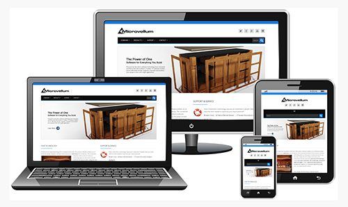
A website cannot be regarded as a professional website if it is not mobile-friendly. It must have both web version and a mobile version for easy navigation for any device used to visit the website. Wix has really tried in making any website hosted with them more mobile-friendly with the Wix intuitive mobile editor.
Now that we have looked at the essential design features of the site, it is also important that you optimize the site for search engines such as Google and Bing. You can do this by properly structuring the URLs, titles, headlines, meta tags, and content. This means that you should work closely with the content developer in order to create a website that not only looks good but will rank highly in search engines.
Testing Before Publishing
Next, another great web design tip is that you should always fully test the website before putting it live. Many web designers simply fail to test out their website(s) and as a result, web users are not able to properly navigate the site. This is especially important if you are creating a corporate website. The use of breadcrumbs is also highly recommended.
If you'd like to check out some more tips, here's a great post about how to create a professional website.
Below is a Video to teach you the professional tips for creating a website. Happy Viewing.


Awesome post. I have been working on rebranding and a new website. These tips will come in handy.
Welcome here Dr. Elise Cohen Ho, Am glad you found the post helpful.
Thanks for sharing these great tips.. Making a website stand out is not about having the most flashy and glamorous site. That is something that only works for poster advertising or window advertising. Many people make the same mistakes when they try to make their website stand out.
Glad by reading your post. Useful tips of Web Design for creating a Professional Website. These tips will be very helpful for me. Alluring Blog !
This is very interesting article post those information is very detailed much, but unfortunately I don’t needed them for now but I will still take note for this and I will share into my friends. Thank you for posting this.
Hi Lauren, Thanks for sharing your thought on this. We will still be expecting you back for more interesting articles.
This is a helpful guide. To get success in online business one must have a professional looking website. Thanks for this share, I think this is a must read for a beginner.
Nice blog, it help me to create a good professional looking website. Thanks for the great blog post.
Hi, thanks for sharing nice tips on website designing. I am going to share this tips on my friends group.
I think that every blogger should make his blog secure by using HTTPS but it is sometimes expensive, create about us and contact us pages and add new posts as you can.
Chrome now display warning page of website not secure to the browser lovers, which implies that Google is trying to force all website owners to use https though it is expensive as you said but using it is the best thing.
Good blog Hiidee, this tips are really professional. It will surely help newbies in creating websites.